DULLUPGRADESPOST (you're probably better off scrolling down to the bottom TBH).
 A while back I said that I'll add a bit of a swooshy interface to the mobile shop. Well, it's there now, kind of. Was hoping to swoosh through products and categories, but it didn't work out (yet) so I have abused the swipeyness in other various ways. These are all mobile shop only things (unless otherwise stated, though if these features work out then they'll quite possibly make their way to the standard shop too).
First up is the new product picker, found on the home page. You can idly swoosh (or tap) through jewellery types, sizes, design types or colours here, which will give you a nice selection of shiny things that match your style.
 Next up is the ability to swipe/tap through sizes on the category page instead of having all those oogly buttons. No more to say about that really ...
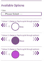
And finally, we have a swooshy option picker on the product page. This allows you to luxuriously swipe (or tap) through the various options, like colours and flare-type, instead of having them STARING YOU IN THE FACE ALL AT ONE OH HELLO. Bit more manageable.
Think I've got it out of my system now, can't think of anything else to swipe :)
I've also done stuff with the search function (mobile and standard shop), as it had trouble with finding products by size, which was just silly. This has now been fixed and you can search by either metric mm or imperial inches to your heart's content.
Dullpost over. We've tested these features out with no problems on quite a few devices, but there's always one or two devices that make strange things happen. If you have any problems with the mobile site or search, then please let us know by our contact form here or by email -- hello (at) lovelyplugly (dot) co (dot) uk.
I haven't finished Mass Effect 3 yet, BTW.
